
 我的书签
我的书签
 添加书签
添加书签 移除书签
移除书签从 v3 到 v4
请先升级到 3.x 的最新版本,按照控制台 warning 信息移除/修改相关的 API。
升级项目 React 16.12.0 以上。
如果你仍在使用 React 15,请参考 。
其余 React 16 废弃生命周期 API 请参考 迁移导引。
行高从
1.5(21px) 调整为1.5715(22px)。字体颜色从
rgba(0, 0, 0, 0.65)调深为rgba(0, 0, 0, 0.85)。4.6.0基础圆角调整,由
4px改为2px。Selected 颜色和 Hovered 颜色进行了交换。
全局阴影优化,调整为三层阴影区分控件层次关系。
气泡确认框中图标的使用改变,由问号改为感叹号。
部分组件选中颜色统一改为
@blue-1: #E6F7FF,对应hover颜色改为@gray-2: #FAFAFA。报错色色值调整,由
@red-5: #F5222D改为@red-5: #FF4D4F。分割线颜色明度降低,由
#E8E8E8改为#F0F0F0。DatePicker 交互重做,面板和输入框分离,范围选择现可单独选择开始和结束时间。
Table 默认背景颜色从透明修改为白色。
Tabs 火柴棍样式缩短为和文字等长。
Tabs 交互重做,DOM 结构改变。
4.3.0
IE 最低支持版本为 IE 11。
React 最低支持版本为 React 16.9,部分组件开始使用 hooks 进行重构。
- 重构通过
useMemo进行性能优化,请勿使用 mutable data 作为参数。
- 重构通过
最低支持的 less 版本为 3.1.0,建议升级到 less 4.x 最新版本。
移除废弃的 API
移除了 LocaleProvider,请使用
ConfigProvider替代。移除了 Mention,请使用
Mentions替代。移除了 Alert 的
iconType属性,请使用icon替代。移除了 Modal.xxx 的
iconType属性,请使用icon替代。移除了 Form.create 方法,
form现可由Form.useForm获取。移除了 Form.Item 的
id属性,请使用htmlFor替代。移除了 Typography 的
setContentRef属性,请使用ref替代。移除了 Tag 的
afterClose属性,请使用onClose替代。移除了 Card 的
noHovering属性,请使用hoverable替代。移除了 Carousel 的
vertical属性,请使用dotPosition替代。移除了 Drawer 的
wrapClassName属性,请使用className替代。移除了 TextArea 的
autosize属性,请使用autoSize替代。移除了 Affix 的
offset属性,请使用offsetTop替代。移除了 Transfer 的
onSearchChange属性,请使用onSearch替代。移除了 Transfer 的
body属性,请使用children替代。移除了 Transfer 的
lazy属性,它并没有起到真正的优化效果。移除了 Select 的
combobox模式,请使用AutoComplete替代。移除了 Table 的
rowSelection.hideDefaultSelections属性,请在rowSelection.selections中使用SELECTION_ALL和SELECTION_INVERT替代,。废弃 Button.Group,请使用
Space代替。
图标升级
在 antd@3.9.0 中,我们引入了 svg 图标(为何使用 svg 图标?)。使用了字符串命名的图标 API 无法做到按需加载,因而全量引入了 svg 图标文件,这大大增加了打包产物的尺寸。在 4.0 中,我们调整了图标的使用 API 从而支持 tree shaking,减少 antd 默认包体积约 150 KB(Gzipped)。
旧版 Icon 使用方式将被废弃:
4.0 中会采用按需引入的方式:
import { Button } from 'antd';// tree-shaking supported- import { Icon } from 'antd';const Demo = () => (<div>- <Icon type="smile" />+ <SmileOutlined /><Button icon={<SmileOutlined />} /></div>);// or directly importimport SmileOutlined from '@ant-design/icons/SmileOutlined';
你将仍然可以通过兼容包继续使用:
import { Button } from 'antd';import { Icon } from '@ant-design/compatible';const Demo = () => (<div><Icon type="smile" /><Button icon="smile" /></div>);
组件重构
Form 重写
不再需要
Form.create。嵌套字段支持从
'xxx.yyy'改成['xxx', 'yyy']。validateTrigger不再收集字段值。迁移文档请查看。
DatePicker 重写
提供
picker属性用于选择器切换。范围选择现在可以单独选择开始和结束时间。
onPanelChange在面板值变化时也会触发。自定义单元格样式的类名从
ant-calendar-date改为ant-picker-cell-inner。
Tree、Select、TreeSelect、AutoComplete 重新写
onBlur时不再修改选中值,且返回 React 原生的event对象。- 如果你在使用兼容包的 Form 且配置了
validateTrigger为onBlur,请改至onChange以做兼容。
- 如果你在使用兼容包的 Form 且配置了
AutoComplete 不再支持
optionLabelProp,请直接设置 Optionvalue属性。AutoComplete 选项与 Select 对齐,请使用
options代替dataSource。Select 移除
dropdownMenuStyle属性。如果你需要设置弹窗高度请使用
listHeight来代替dropdownStyle的高度样式。filterOption第二个参数直接返回原数据,不在需要通过option.props.children来进行匹配。Tree、TreeSelect 同时指定
title和label的时候,会选择显示label。为了labelInValue行为一致进行了该调整。(在第一个节点展示 ‘label’),旧行为(在第一个节点展示 ‘title’)。Tree 传入内容采用
treeData属性,来代替TreeNode方式,TreeNode 依然可用,但是会在控制台抛出警告。
Grid 组件使用 flex 布局。
Button 的
danger现在作为一个属性而不是按钮类型。Input、Select 的
value为undefined时改为非受控状态。Table 重写
在没有
columns时仍然会保留一列。嵌套
dataIndex支持从'xxx.yyy'改成['xxx', 'yyy']。
Pagination 自
4.1.0起大于 50 条数据默认会展示pageSize切换器,这条规则同样会运用于 Table 上。Tabs 重写()
Dom 结构变化,如有覆盖样式需要仔细检查。
横向滚动交互变化,
onPrevClick和onNextClick不再工作。
less 变量变化,如 DatePicker/TimePicker/Calendar 相关变量已全部重构,又如 @btn-padding-base 等进行了重命名,具体变化请自行对比 和 4.x 变量。
你可以手动对照上面的列表逐条检查代码进行修改,另外,我们也提供了一个 codemod cli 工具 以帮助你快速升级到 v4 版本。
在运行 codemod cli 前,请先提交你的本地代码修改。
# 通过 npx 直接运行npx -p @ant-design/codemod-v4 antd4-codemod src# 或者全局安装# 使用 npmnpm i -g @ant-design/codemod-v4# 或者使用 yarnyarn global add @ant-design/codemod-v4# 运行antd4-codemod src
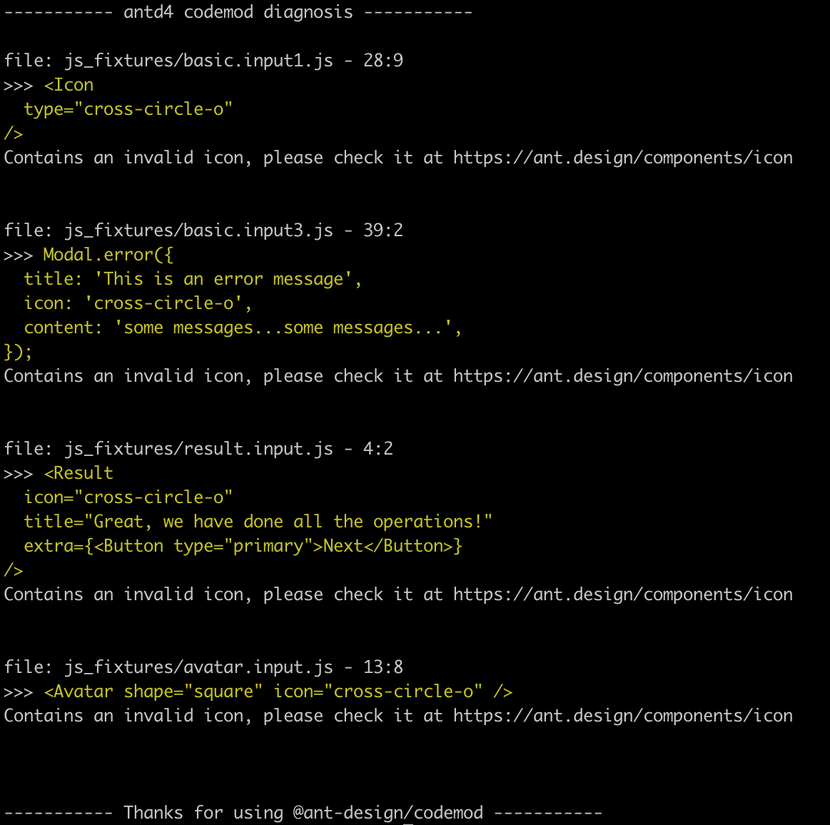
对于无法自动修改的部分,codemod 会在命令行进行提示,建议按提示手动修改。修改后可以反复运行上述命令进行检查。
@ant-design/codemod-v4 会帮你迁移到 antd v4, 废弃的组件则通过 保持运行, 一般来说你无需手动迁移。下方内容详细介绍了整体的迁移和变化,你也可以参照变动手动修改。
将已废弃的 Form 和 Mention 组件通过 @ant-design/compatible 包引入
- import { Form, Input, Button, Mention } from 'antd';+ import { Form, Mention } from '@ant-design/compatible';+ import '@ant-design/compatible/assets/index.css';+ import { Input, Button } from 'antd';ReactDOM.render(<><Form>{getFieldDecorator('username')(<Input />)}<Button>Submit</Button></Form><Mentionstyle={{ width: '100%' }}onChange={onChange}defaultValue={toContentState('@afc163')}defaultSuggestions={['afc163', 'benjycui']}onSelect={onSelect}/></>);
注意:从
@ant-design/compatible引入的老版本 Form 组件,样式类名会从.ant-form变成.ant-legacy-form,如果你对其进行了样式覆盖,也需要相应修改。
用新的 @ant-design/icons 替换字符串类型的 icon 属性值
将 v3 Icon 组件转换成 @ant-design/icons 中引入
- import { Icon, Input } from 'antd';+ import { Input } from 'antd';+ import Icon, { CodeFilled, SmileOutlined, SmileTwoTone } from '@ant-design/icons';const HeartSvg = () => (<svg width="1em" height="1em" fill="currentColor" viewBox="0 0 1024 1024"><path d="M923 plapla..." /></svg>);const HeartIcon = props => <Icon component={HeartSvg} {...props} />;ReactDOM.render(<div>- <Icon type="code" theme="filled" />+ <CodeFilled />- <Icon type="smile" theme="twoTone" twoToneColor="#eb2f96" />+ <SmileTwoTone twoToneColor="#eb2f96" />- <Icon type="code" theme={props.fill ? 'filled' : 'outlined'} />+ <LegacyIcon type="code" theme={props.fill ? 'filled' : 'outlined'} /><HeartIcon /><Icon viewBox="0 0 24 24"><title>Cool Home</title><path d="M10 20v-6h4v6h5v-8h3L12 3 2 12h3v8z" /></Icon><Input suffix={<SmileOutlined />} /></div>,mountNode,);
将 v3 LocaleProvider 组件转换成 v4 ConfigProvider 组件
- import { LocaleProvider } from 'antd';+ import { ConfigProvider } from 'antd';ReactDOM.render(- <LocaleProvider {...yourConfig}>+ <ConfigProvider {...yourConfig}><Main />- </LocaleProvider>+ </ConfigProvider>);

