
 我的书签
我的书签
 添加书签
添加书签 移除书签
移除书签页面中的非浮层元素,不会自动消失。
Alert 组件提供四种主题,由属性指定,默认值为info。
主题
Alert 组件提供了两个不同的主题:light和dark。
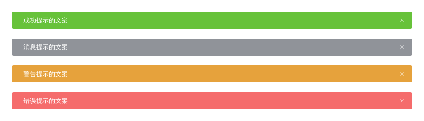
<template><el-alerttitle="成功提示的文案"type="success"effect="dark"></el-alert><el-alerttitle="消息提示的文案"type="info"</el-alert><el-alerttitle="警告提示的文案"type="warning"effect="dark"></el-alert>title="错误提示的文案"type="error"effect="dark"></el-alert></template>
自定义关闭按钮
自定义关闭按钮为文字或其他符号。
在 Alert 组件中,你可以设置是否可关闭,关闭按钮的文本以及关闭时的回调函数。closable属性决定是否可关闭,接受boolean,默认为true。你可以设置close-text属性来代替右侧的关闭图标,注意:close-text必须为文本。设置close事件来设置关闭时的回调。
表示某种状态时提升可读性。
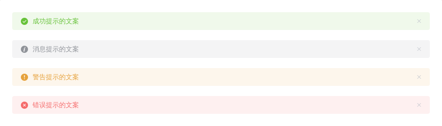
<template><el-alerttitle="成功提示的文案"type="success"show-icon></el-alert><el-alerttype="info"</el-alert><el-alerttitle="警告提示的文案"type="warning"show-icon></el-alert><el-alerttitle="错误提示的文案"type="error"show-icon></el-alert></template>
文字居中
使用 center 属性让文字水平居中。
带有辅助性文字介绍
包含标题和内容,解释更详细的警告。

除了必填的title属性外,你可以设置description属性来帮助你更好地介绍,我们称之为辅助性文字。辅助性文字只能存放单行文本,会自动换行显示。
<template><el-alerttitle="带辅助性文字介绍"type="success"description="这是一句绕口令:黑灰化肥会挥发发灰黑化肥挥发;灰黑化肥会挥发发黑灰化肥发挥。 黑灰化肥会挥发发灰黑化肥黑灰挥发化为灰……">
最后,这是一个同时具有 icon 和辅助性文字的样例。

