
 我的书签
我的书签
 添加书签
添加书签 移除书签
移除书签
className: PropTypes.string,closeClassName: PropTypes.string,color: PropTypes.string, // default: 'success'isOpen: PropTypes.bool, // default: truetoggle: PropTypes.func,tag: PropTypes.oneOfType([PropTypes.func, PropTypes.string]),fade: PropTypes.bool, // default: true// Controls the transition of the alert fading in and out// See for more detailstransition: PropTypes.shape(Fade.propTypes),
Link color
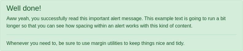
import React from 'react';import { Alert } from 'reactstrap';const Example = (props) => {return (<Alert color="success"><h4 className="alert-heading">Well done!</h4><p>Aww yeah, you successfully read this important alert message. This example text is goingto run a bit longer so that you can see how spacing within an alert works with this kindof content.</p><hr /><p className="mb-0">Whenever you need to, be sure to use margin utilities to keep things nice and tidy.</p></div>);};
Dismissing
For the most basic use-case an uncontrolled component can provide the functionality wanted without the need to manage/control the state of the component. UncontrolledAlert does not require isOpen nor toggle props to work.
import React from 'react';import { UncontrolledAlert } from 'reactstrap';function AlertExample() {return (<UncontrolledAlert color="info">I am an alert and I can be dismissed!</UncontrolledAlert>);}export default AlertExample;
Alerts without fade


