Properties
active: PropTypes.bool, 'aria-label': PropTypes.string, block: PropTypes.bool, color: PropTypes.string, // default: 'secondary' disabled: PropTypes.bool, outline: PropTypes.bool, // Pass in a Component to override default button element // example: react-router Link // default: 'button' tag: PropTypes.oneOfType([ PropTypes.func, PropTypes.string, PropTypes.shape({ $$typeof: PropTypes.symbol, render: PropTypes.func }), PropTypes.arrayOf(PropTypes.oneOfType([ PropTypes.func, PropTypes.string, PropTypes.shape({ $$typeof: PropTypes.symbol, render: PropTypes.func }), ])) ]), // ref will only get you a reference to the Button component, use innerRef to get a reference to the DOM element (for things like focus management). innerRef: PropTypes.oneOfType([PropTypes.object, PropTypes.func, PropTypes.string]), onClick: PropTypes.func, size: PropTypes.string, children: PropTypes.node, className: PropTypes.string, cssModule: PropTypes.object, // use close prop for BS4 close icon utility}Button.defaultProps = { color: 'secondary', tag: 'button',
import React from 'react';import { Button } from 'reactstrap';export default class Example extends React.Component { render() { return ( <div> <Button outline color="primary">primary</Button>{' '} <Button outline color="secondary">secondary</Button>{' '} <Button outline color="success">success</Button>{' '} <Button outline color="info">info</Button>{' '} <Button outline color="warning">warning</Button>{' '} <Button outline color="danger">danger</Button> </div> ); }}
Sizes
Large ButtonLarge Button
Small ButtonSmall Button
<Button color="primary" size="sm">Small Button</Button>{' '}<Button color="secondary" size="sm">Small Button</Button>
Block level buttonBlock level button
<Button color="primary" size="lg" block>Block level button</Button><Button color="secondary" size="lg" block>Block level button</Button>
Primary linkLink
Disabled State
Primary buttonButton
<Button color="primary" size="lg" disabled>Primary button</Button>{' '}<Button color="secondary" size="lg" disabled>Button</Button>
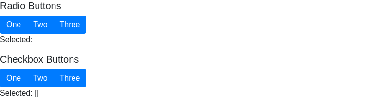
import React, { Component } from 'react';import { Button, ButtonGroup } from 'reactstrap';class Example extends Component { constructor (props) { super(props); this.state = { cSelected: [] }; this.onRadioBtnClick = this.onRadioBtnClick.bind(this); } onRadioBtnClick(rSelected) { } onCheckboxBtnClick(selected) { const index = this.state.cSelected.indexOf(selected); if (index < 0) { this.state.cSelected.push(selected); } else { this.state.cSelected.splice(index, 1); } this.setState({ cSelected: [...this.state.cSelected] }); } render() { return ( <div> <h5>Radio Buttons</h5> <ButtonGroup> <Button color="primary" onClick={() => this.onRadioBtnClick(1)} active={this.state.rSelected === 1}>One</Button> <Button color="primary" onClick={() => this.onRadioBtnClick(2)} active={this.state.rSelected === 2}>Two</Button> <Button color="primary" onClick={() => this.onRadioBtnClick(3)} active={this.state.rSelected === 3}>Three</Button> </ButtonGroup> <p>Selected: {this.state.rSelected}</p> <h5>Checkbox Buttons</h5> <ButtonGroup> <Button color="primary" onClick={() => this.onCheckboxBtnClick(1)} active={this.state.cSelected.includes(1)}>One</Button> <Button color="primary" onClick={() => this.onCheckboxBtnClick(2)} active={this.state.cSelected.includes(2)}>Two</Button> <Button color="primary" onClick={() => this.onCheckboxBtnClick(3)} active={this.state.cSelected.includes(3)}>Three</Button> </ButtonGroup> <p>Selected: {JSON.stringify(this.state.cSelected)}</p> </div> ); }}
Close icon

 我的书签
我的书签
 添加书签
添加书签 移除书签
移除书签
