Properties
// Pass in a Component to override default element tag: PropTypes.oneOfType([PropTypes.func, PropTypes.string]), inverse: PropTypes.bool, color: PropTypes.string, body: PropTypes.bool, className: PropTypes.string};CardBody.propTypes = { // Pass in a Component to override default element tag: PropTypes.oneOfType([PropTypes.func, PropTypes.string]), className: PropTypes.string};CardColumns.propTypes = { // Pass in a Component to override default element tag: PropTypes.oneOfType([PropTypes.func, PropTypes.string]), className: PropTypes.string};CardDeck.propTypes = { // Pass in a Component to override default element tag: PropTypes.oneOfType([PropTypes.func, PropTypes.string]), className: PropTypes.string};CardFooter.propTypes = { // Pass in a Component to override default element tag: PropTypes.oneOfType([PropTypes.func, PropTypes.string]), className: PropTypes.string};CardGroup.propTypes = { // Pass in a Component to override default element tag: PropTypes.oneOfType([PropTypes.func, PropTypes.string]), className: PropTypes.string};CardHeader.propTypes = { // Pass in a Component to override default element tag: PropTypes.oneOfType([PropTypes.func, PropTypes.string]), className: PropTypes.string};CardImg.propTypes = { // Pass in a Component to override default element tag: PropTypes.oneOfType([PropTypes.func, PropTypes.string]), className: PropTypes.string, // Use top or bottom to position image via "card-img-top" or "card-img-bottom" top: PropTypes.bool, bottom: PropTypes.bool};CardImgOverlay.propTypes = { // Pass in a Component to override default element tag: PropTypes.oneOfType([PropTypes.func, PropTypes.string]), className: PropTypes.string};CardLink.propTypes = { // Pass in a Component to override default element tag: PropTypes.oneOfType([PropTypes.func, PropTypes.string]), className: PropTypes.string, // ref will only get you a reference to the CardLink component, use innerRef to get a reference to the DOM element (for things like focus management). innerRef: PropTypes.oneOfType([PropTypes.func, PropTypes.string])};CardSubtitle.propTypes = { // Pass in a Component to override default element tag: PropTypes.oneOfType([PropTypes.func, PropTypes.string]), className: PropTypes.string};CardText.propTypes = { // Pass in a Component to override default element tag: PropTypes.oneOfType([PropTypes.func, PropTypes.string]), className: PropTypes.string};CardTitle.propTypes = { // Pass in a Component to override default element tag: PropTypes.oneOfType([PropTypes.func, PropTypes.string]), className: PropTypes.string};
import React from 'react';import { Card, CardImg, CardText, CardBody, CardLink, CardTitle, CardSubtitle } from 'reactstrap';const Example = (props) => { return ( <div> <Card> <CardBody> <CardTitle>Card title</CardTitle> <CardSubtitle>Card subtitle</CardSubtitle> </CardBody> <img width="100%" src="https://placeholdit.imgix.net/~text?txtsize=33&txt=318%C3%97180&w=318&h=180" alt="Card image cap" /> <CardBody> <CardText>Some quick example text to build on the card title and make up the bulk of the card's content.</CardText> <CardLink href="#">Card Link</CardLink> <CardLink href="#">Another Link</CardLink> </CardBody> </div> );};export default Example;
Sizing
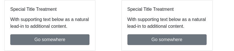
import React from 'react';import { Card, Button, CardTitle, CardText, Row, Col } from 'reactstrap'; return ( <Row> <Col sm="6"> <Card body> <CardTitle>Special Title Treatment</CardTitle> <CardText>With supporting text below as a natural lead-in to additional content.</CardText> <Button>Go somewhere</Button> </Card> </Col> <Col sm="6"> <Card body> <CardTitle>Special Title Treatment</CardTitle> <CardText>With supporting text below as a natural lead-in to additional content.</CardText> <Button>Go somewhere</Button> </Card> </Col> </Row> );};export default Example;
Text alignment
import React from 'react';import { Card, Button, CardHeader, CardFooter, CardBody, CardTitle, CardText } from 'reactstrap';const Example = (props) => { return ( <div> <Card> <CardHeader>Header</CardHeader> <CardBody> <CardTitle>Special Title Treatment</CardTitle> <CardText>With supporting text below as a natural lead-in to additional content.</CardText> <Button>Go somewhere</Button> </CardBody> <CardFooter>Footer</CardFooter> </Card> <Card> <CardHeader tag="h3">Featured</CardHeader> <CardBody> <CardTitle>Special Title Treatment</CardTitle> <CardText>With supporting text below as a natural lead-in to additional content.</CardText> <Button>Go somewhere</Button> </CardBody> <CardFooter className="text-muted">Footer</CardFooter> </Card> </div> );};export default Example;
Image caps
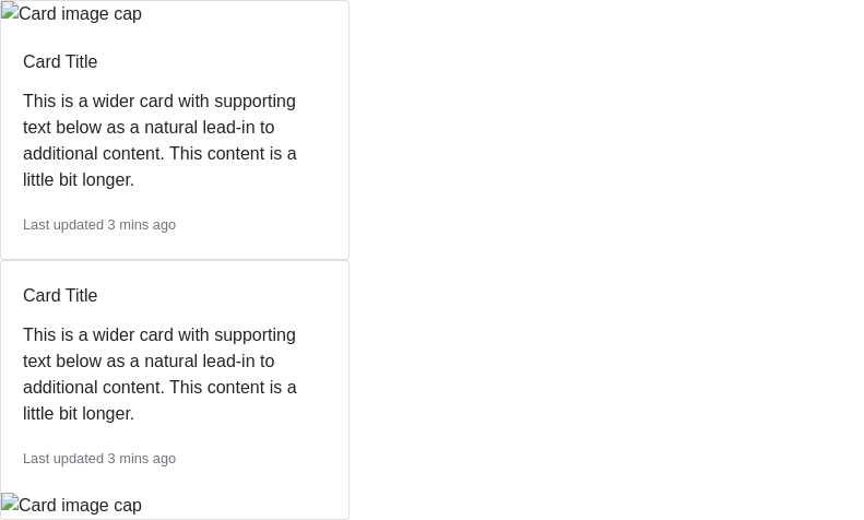
import React from 'react';import { Card, CardBody, Button, CardTitle, CardText, CardImg } from 'reactstrap';const Example = (props) => { return ( <div> <Card> <CardImg top width="100%" src="" alt="Card image cap" /> <CardBody> <CardTitle>Card Title</CardTitle> <CardText>This is a wider card with supporting text below as a natural lead-in to additional content. This content is a little bit longer.</CardText> <CardText> <small className="text-muted">Last updated 3 mins ago</small> </CardText> </CardBody> </Card> <Card> <CardBody> <CardTitle>Card Title</CardTitle> <CardText>This is a wider card with supporting text below as a natural lead-in to additional content. This content is a little bit longer.</CardText> <CardText> <small className="text-muted">Last updated 3 mins ago</small> </CardText> </CardBody> <CardImg bottom width="100%" src="https://placeholdit.imgix.net/~text?txtsize=33&txt=318%C3%97180&w=318&h=180" alt="Card image cap" /> </Card> </div> );};export default Example;
Image overlays
import React from 'react';import { Card, CardTitle, CardText, CardImg, CardImgOverlay } from 'reactstrap';const Example = (props) => { return ( <div> <Card inverse> <CardImg width="100%" src="" alt="Card image cap" /> <CardImgOverlay> <CardTitle>Card Title</CardTitle> <CardText>This is a wider card with supporting text below as a natural lead-in to additional content. This content is a little bit longer.</CardText> <CardText> <small className="text-muted">Last updated 3 mins ago</small> </CardText> </CardImgOverlay> </Card> </div> );};export default Example;
Outline variants
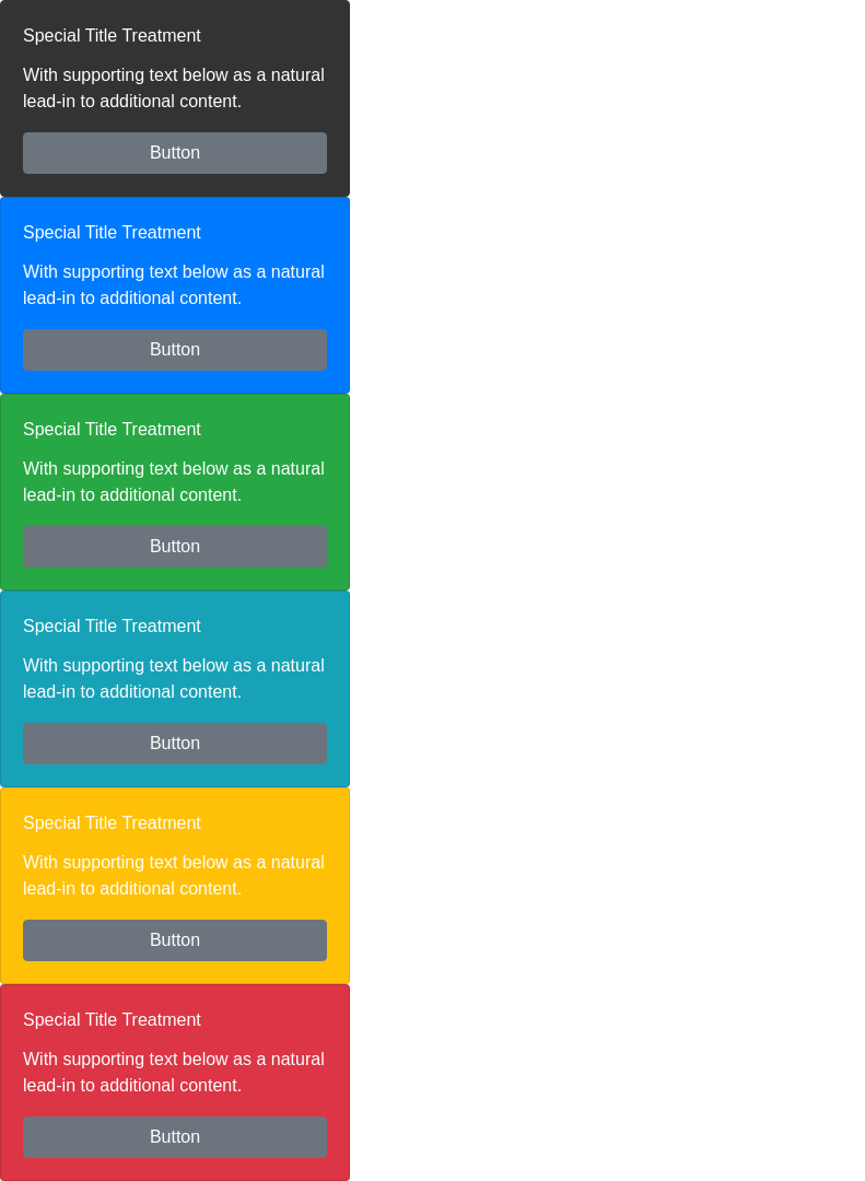
import React from 'react';import { Card, Button, CardTitle, CardText } from 'reactstrap';const Example = (props) => { return ( <div> <Card body outline color="secondary"> <CardText>With supporting text below as a natural lead-in to additional content.</CardText> <Button>Button</Button> </Card> <Card body outline color="primary"> <CardTitle>Special Title Treatment</CardTitle> <CardText>With supporting text below as a natural lead-in to additional content.</CardText> <Button color="secondary">Button</Button> </Card> <Card body outline color="success"> <CardTitle>Special Title Treatment</CardTitle> <CardText>With supporting text below as a natural lead-in to additional content.</CardText> <Button color="secondary">Button</Button> </Card> <Card body outline color="info"> <CardTitle>Special Title Treatment</CardTitle> <CardText>With supporting text below as a natural lead-in to additional content.</CardText> <Button color="secondary">Button</Button> </Card> <Card body outline color="warning"> <CardTitle>Special Title Treatment</CardTitle> <CardText>With supporting text below as a natural lead-in to additional content.</CardText> <Button color="secondary">Button</Button> </Card> <Card body outline color="danger"> <CardTitle>Special Title Treatment</CardTitle> <CardText>With supporting text below as a natural lead-in to additional content.</CardText> <Button color="secondary">Button</Button> </Card> </div> );};export default Example;
Groups
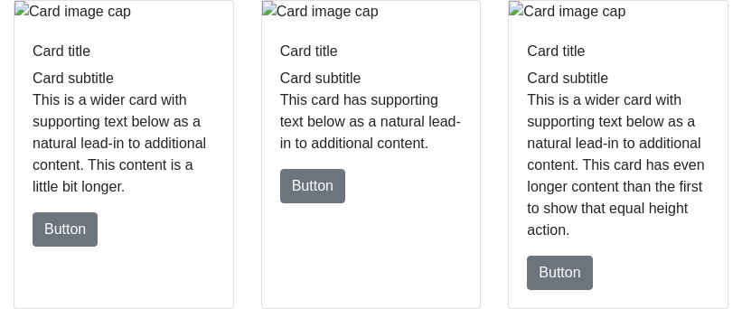
import React from 'react';import { Card, Button, CardImg, CardTitle, CardText, CardGroup, CardSubtitle, CardBody } from 'reactstrap';const Example = (props) => { return ( <CardGroup> <Card> <CardImg top width="100%" src="https://placeholdit.imgix.net/~text?txtsize=33&txt=256%C3%97180&w=256&h=180" alt="Card image cap" /> <CardBody> <CardTitle>Card title</CardTitle> <CardSubtitle>Card subtitle</CardSubtitle> <CardText>This is a wider card with supporting text below as a natural lead-in to additional content. This content is a little bit longer.</CardText> <Button>Button</Button> </CardBody> </Card> <Card> <CardImg top width="100%" src="" alt="Card image cap" /> <CardBody> <CardTitle>Card title</CardTitle> <CardSubtitle>Card subtitle</CardSubtitle> <CardText>This card has supporting text below as a natural lead-in to additional content.</CardText> <Button>Button</Button> </CardBody> </Card> <Card> <CardImg top width="100%" src="https://placeholdit.imgix.net/~text?txtsize=33&txt=256%C3%97180&w=256&h=180" alt="Card image cap" /> <CardBody> <CardTitle>Card title</CardTitle> <CardSubtitle>Card subtitle</CardSubtitle> <CardText>This is a wider card with supporting text below as a natural lead-in to additional content. This card has even longer content than the first to show that equal height action.</CardText> <Button>Button</Button> </CardBody> </Card> </CardGroup> );};export default Example;
import React from 'react';import { Card, Button, CardImg, CardTitle, CardText, CardDeck, CardSubtitle, CardBody } from 'reactstrap';const Example = (props) => { return ( <CardDeck> <Card> <CardImg top width="100%" src="" alt="Card image cap" /> <CardBody> <CardTitle>Card title</CardTitle> <CardSubtitle>Card subtitle</CardSubtitle> <CardText>This is a wider card with supporting text below as a natural lead-in to additional content. This content is a little bit longer.</CardText> <Button>Button</Button> </CardBody> </Card> <Card> <CardImg top width="100%" src="https://placeholdit.imgix.net/~text?txtsize=33&txt=256%C3%97180&w=256&h=180" alt="Card image cap" /> <CardBody> <CardTitle>Card title</CardTitle> <CardSubtitle>Card subtitle</CardSubtitle> <CardText>This card has supporting text below as a natural lead-in to additional content.</CardText> <Button>Button</Button> </CardBody> </Card> <Card> <CardImg top width="100%" src="" alt="Card image cap" /> <CardBody> <CardTitle>Card title</CardTitle> <CardSubtitle>Card subtitle</CardSubtitle> <CardText>This is a wider card with supporting text below as a natural lead-in to additional content. This card has even longer content than the first to show that equal height action.</CardText> <Button>Button</Button> </CardBody> </Card> </CardDeck> );};
Columns

 我的书签
我的书签
 添加书签
添加书签 移除书签
移除书签
